Introduction
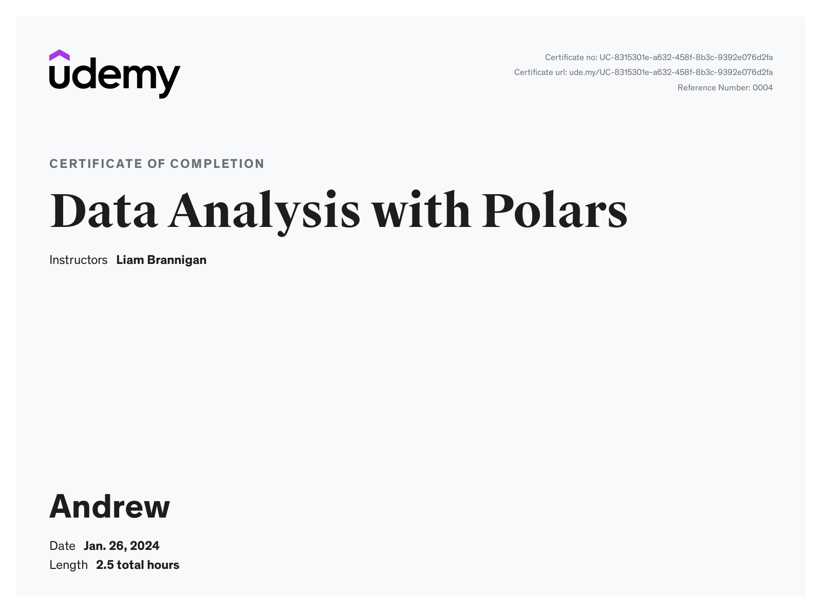
After the previous course about Polars, I was excited to learn more. I settled on Data Analysis with Polars with Liam Brannigan instructing. I was drawn to this because of the mention of visualization using Matplotlib, Seaborn, Altair and Plotly. The course is billed at 2.5 hours long and is currently going for $85, though I did pick this up during one of Udemy's many sales.
Let's get started on the review and why I rated it so low.
Course
I have multiple complaints about this course.
- The entire course is reading from pre-built notebooks or slides.
- The last 26 out of 27 lectures are one page slides.
- The quizzes in the middle of the courses are not effective, because the course is not designed for the learner to actually do any coding.
- The exercises at the end of lectures are never revisited.
This course felt like the instructor was given a bunch of Jupyter notebooks by a more senior instructor and told to go teach the class. There is a lot of reading directly from the notebook, quickly glossing over code, and then talking through the output of the code. Unlike the last course, this one doesn't even feel like a cookbook of usefulness. It's just a glorified slide deck.
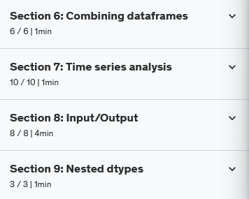
Let me show you what I mean. This is the course list's last 4 sections. I've collapsed them to show only the section header so it's a reasonable sized screenshot.

There are 27 lectures in these 4 sections. The total estimated time for these 27 lectures - 7 minutes. There is only 1 video in this entire group of sections. The other 26 out of 27 lectures are one page slides. The slides are "What you'll learn by the end of this lecture" slides and a link to a Jupyter notebook.
The quizzes scattered through out the course are also ineffective. Many of the questions asked are asking what code provided is correct. These can be helpful, if the learner has done any hands on work during the course. But, this course isn't designed that way. It's an instructor reading slides, hand waving at some code, and then executing the code to show it works. It's ineffective.
The same problem holds true with the exercises at the end of many lectures. They are designed to get the student more experience and I started doing them early in the course. But, they are never revisited. The instructor doesn't talk about them. It's just homework that's assigned as busy work, essentially.
Conclusion
Avoid this course. Nearly half the course is just a single slide for the lectures. The items I was interested in learning about - visualizations - were among those one page slides. The course is designed like a glorified README, and its not worth the sales price I paid, let alone the full price.

